Wednesday 31 July 2019

AEM - Touch UI Dialog - Display fields in a same row | Two Column Layout

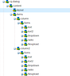
In Touch UI dailog Coral/Granite type fields displays in a stack/top to bottom, one after another in a floating dialog and in fullscreen. In fullscreen it can be displayed in 2 column layout if column layout is used for dialog (columns inside granite/ui/components/foundation/layouts/fixedcolumns type )


and It will show fields in dailog like below:

Floating mode and Fullscreen mode


Improve Authoring Experience

Visit https://experiencemanaged.com/posts/improve-the-aem-authoring-experience-ax.html blog to see how authoring experience can be improved.


There are several scenarios where having a top-to-bottom approach to all fields can have a negative impact on the authoring experience. To improve the experience, fields can be added one after another in the same row.

How to do it

  • Create clientlibs from code mentioned in ClientLibs Code section
  • Add rowresume (Boolean) = true property in the field to display field in the same row. Make sure this property is added in all the fields which should display in the same row.

rowresume property

  • Add rowresume property in the field, if Coral2 type is used 
  • if you are using coral3/Granite type then add rowresume property in granite:data node


'rowresume' Coral2 resource type


'rowresume' Granite/Coral3 resource type

ClientLibs Code 

  1. Create a clientlibs of category 'cq.authoring.dialog'
  2. Create js.txt , css.txt, dialog.field.2column-layout.css and dialog.field.2column-layout.js files with below content or click on the file name to get the file from Github.

js.txt
dialog.field.2column-layout.js

dialog.field.2column-layout.js

(function($, $document) {
    "use strict";
    $document.on("dialog-ready", function() {
        var items = $('[data-rowresume="true"]');
        $(items).each(function(i) {
            $(this).closest('.coral-Form-fieldwrapper').addClass("coral-Form-fieldwrapper--rowresume");
        });
    });

})($, $(document));

css.txt
dialog.field.2column-layout.css

dialog.field.2column-layout.css
.coral-Form-fieldwrapper.coral-Form-fieldwrapper--rowresume {
    width: 44%;
    display: inline-grid;
    margin: 0 3%;
}


Dailog fields after adding rowresume property to width, height, dropdown and radio group fields


Fullscreen mode


Dailog fields after adding rowresume property to height, dropdown and radio group fields


Package

You can install below packages from GitHub to enable this feature for touch ui dialog. These works in AEM 6.3+


However, packages contain:
1. Clientlibs to enable side panel option in touch ui dialog.
2. Clientlibs to enable displaying touch ui field in two-column layout in floating touch UI dialog


If you install this package, Below files will be installed in the repository at 

  • /apps/commons/clientlibs/dialog/js.txt
  • /apps/commons/clientlibs/dialog/js/dialog.field.2column-layout.js
  • /apps/commons/clientlibs/dialog/css.txt
  • /apps/commons/clientlibs/dialog/css/dialog.field.2column-layout.css


Other files are getting used to enable side panel option in touch ui dialog, Find more details about it at AEM - Touch UI Dialog - Assets Panel


Limitation:

Work only with form field type.

Monday 29 July 2019

AEM - Touch UI Dialog - Assets Panel

In Touch UI dailog when we use file upload type e.g. cq/gui/components/authoring/dialog/fileupload or granite/ui/components/foundation/form/fileupload field to allow authoring assets from the side panel.
In order to author the images, side panel should be opened before editing via dialog.


AEM Page editor with side panel and dialog opened


Authoring image using drag and drop


If you forgot to open the side panel before opening the dialog then you need to close the dialog, open side panel and open the dialog again to author assets.


This is kind of annoying to close the dialog and open it again just to author images/Assets. 
Why can't the side panel open from the dialog without closing the dialog?


That's it, here you go -


Side panel toggle button in dialog header


side panel toggle from dailog


How to do it

This can be achieved by simply adding a side panel toggle button in the dialog header alongside help or other buttons. When clicking on this button, the click event will be triggered on the actual side panel toggle button and rest will be OOTB.
  1. Create a clientlibs of category 'cq.authoring.dialog'
  2. Create js.txt and dialog.sidepanel.js files with below content or click on file name to get file from github.


js.txt
dialog.sidepanel.js

dialog.sidepanel.js


(function($, $document) {
    "use strict";
    var flag = true;
    $document.on("dialog-ready", function() {

        var buttonHTML = '<button is="coral-button" icon="railLeft" variant="minimal" class="cq-dialog-header-action cq-dialog-railLeft coral-Button" type="button" title="Toggle Side Panel" size="M">';
        buttonHTML += '<coral-icon class="coral-Icon coral-Icon--sizeS coral-Icon--railLeft coral3-Icon--railLeft" icon="railLeft" size="S" role="img" aria-label="rail left"></coral-icon>';
        buttonHTML += '<coral-button-label></coral-button-label>';
        buttonHTML += '</button>';

        $('.cq-Dialog coral-dialog-header.cq-dialog-header>div.cq-dialog-actions > button:nth-child(1)').after(buttonHTML);

        if (flag)
            $(document).on('click', 'button.cq-dialog-railLeft', toggleLeftRail);

        function toggleLeftRail() {
            flag = false;
            $('.editor-GlobalBar coral-actionbar-primary coral-actionbar-item button.toggle-sidepanel').click();
        }

    });

})($, $(document));


Or For AEMaaCS

https://github.com/arunpatidar02/aemaacs-aemlab/blob/master/ui.apps/src/main/content/jcr_root/apps/aemlab/oneweb/concept/clientlibs/author/clientlib-dialog-sidepanel-toggle/js/dialog.sidepanel.js 

Package

You can install below packages from GitHub to enable side panel option in touch ui dialog. These works in AEM 6.3+


However, packages contain:
1. Clientlibs to enable side panel option in touch ui dialog.
2. Clientlibs to enable displaying touch ui field in two-column layout in floating touch UI dialog


If you install this package, Below files will be installed in the repository at 

  • /apps/commons/clientlibs/dialog/js.txt
  • /apps/commons/clientlibs/dialog/js/dialog.sidepanel.js


Other files are getting used to showing field in the same row, more details at https://aemlab.blogspot.com/2019/07/aem-touch-ui-dialog-fields-in-same-row.html.
  • /apps/commons/clientlibs/dialog/js/dialog.field.2column-layout.js
  • /apps/commons/clientlibs/dialog/css.txt
  • /apps/commons/clientlibs/dialog/css/dialog.field.2column-layout.css


Tuesday 16 July 2019

AEM - Touch UI - RTE HTML Element Selector, Custom Style Plugin & Color Picker Plugin

Touch UI RTE is the always challenging topic because of a lack of documentation to create or customize plugins, There are great articles at http://experience-aem.blogspot.com/2013/08/in-blog-experiencing-adobe-experience.html which talk about RTE plugins. I got the idea from ColorPicker plugin and tried to create a new Style Picker plugin which may help AEM community to achieve more from RTE.


This blog covers : 
HTML DOM Navigation and HTML element selector inside RTE Editor
Custom Style(Style Picker) Plugins
Color Picker Plugin

  • HTML DOM Elements Navigator extension:
    • Shows selected/current HTML element's DOM structure in RTE
    • Allows selecting an exact HTML element in RTE to apply settings using RTE plugins.
  • Style Picker Plugins apply a class attribute to selected HTML elements unlike OOTB style plugin create span tag. The exact HTML element can be selected from DOM navigator e.g. ul, ol, hr, p, div, img etc. These elements can be selected by DOM Element Navigator and class can be applied to them. 
  • The Color Picker Plugin as same as ColorPicker Plugin from http://experience-aem.blogspot.com but I modified it to work with all AEM version from 6.3+


Color Picker, Style Picker Plugins and HTML DOM navigation


RTE Element Selection from DOM navigation


Applying class to ul element using Style Picker

When selected item already has existing styles, the style will be pre-selected in the dropdown, If another style is chosen, the new class will be added and existing class will also remain, this will allow applying multiple styles to a single element.
In case of applying a different style or a single style to an element then an existing style should be chosen and removed using the Remove Style button. 


Pre-selected style


Applying another style to list


Removing style from the list


If only a text is selected for applying the style using this custom style picker plugin, the style will be added to its parent's node. If you want to apply a style to text using a span tag, use OOTB style plugin.


Style is added to P tag


OOTB style plugin, style added with a span tag


Note: If multiple HTML items are selected then the style will be applied to only one element.


Code

You can install below packages from GitHub to use these plugins in AEM 6.3+
Packages contain:
AEMaaCS version - aem-rte-plugins-1.5.zip


Details


1. DOM Elements Navigation and Selector inside RTE Editor

In RTE, the element tree breadcrumb is created at the bottom section of RTE, which shows the DOM navigation and allow a user to select a particular HTML element in RTE by clicking on breadcrumb items.

RTE Navigation will only be shown for the RTE which has showBreadcrumb property with true.


ShowBreadcrumb property in RTE item node


RTE DOM Tree


Although navigation can be enable for all the RTEs by changing below line in /apps/commons/rte/rte-breadcrumb/js/rte-breadcrumb.js file
replace
$('.coral-RichText[data-showbreadcrumb="true"]').each(function() {
                $(this).parent().find(".rte-sourceEditor").after(breadcrumbItem);
});

with 
$('.coral-RichText').each(function() {
                $(this).parent().find(".rte-sourceEditor").after(breadcrumbItem);
});


The DOM navigation extension is independent to style plugin and can be used with other plugins as well to select, cut, copy etc.


2. Custom Style Picker Plugins

StylePicker Plugin in RTE toolbar


After installing the package you can find the Style Picker Plugins files at:

Plugins JS and CSS at
/apps/commons/rte/plugins/clientlibs/js/style-picker.js
/apps/commons/rte/plugins/clientlibs/css/style-picker.css


Plugins popover dialogs
/apps/commons/rte/plugins/popovers/style-picker


Plugin Popover Dialog - dropdown option datasource and JSON at
  • /apps/commons/rte/plugins/popovers/style-picker/datasource
  • /apps/commons/rte/plugins/popovers/style-picker/options.json


Datasource is a JSP file which read json specified in options property and populates dropdown option for Style Picker plugin.
JSON file should have an array of elements in below format:

If want to show as Heading/Category use below format(value could be anything)
    {"text": "Background Color","value": "BTC","heading": "true"}


If Option

    {"text": "White","value": "white"}

Example : /apps/commons/rte/plugins/popovers/style-picker/options.json


[
    {"text": "Background Color","value": "BTC","heading": "true"},
    {"text": "White","value": "white"},
    {"text": "Black","value": "black"},
    {"text": "Green","value": "green"},
    {"text": "Orange","value": "orange"},
    {"text": "Light Grey","value": "lightgrey"},
    {"text": "List Style","value": "LS","heading": "true"},
    {"text": "Check","value": "list-checked"},
    {"text": "Cross","value": "list-crossed"},
    {"text": "Link Style","value": "LS","heading": "true"},
    {"text": "Primary","value": "btn-primary"},
    {"text": "Secondary","value": "btn-secondary"}
]


List Style and List Style are the Category and can't be selected


Plugin configuration in RTE
create 'styleformat' child node of rtePlugins node and create features property in it with * value as shown in below screenshot.


Add 'styleformat#styles' in toolbar property on inline node as shown in below screenshot.


3. Color Picker Plugin


ColorPicker Plugin in RTE toolbar


After installing the package you can find the ColorPicker Plugins files at :

Plugins JS and CSS at
/apps/commons/rte/plugins/clientlibs/js/color-picker.js
/apps/commons/rte/plugins/clientlibs/css/color-picker.css


Plugins popover dialogs
/apps/commons/rte/plugins/popovers/color-picker

Plugin configuration in RTE
create 'colorformat' child node of rtePlugins node and create features property in it with * value as shown in below screenshot.


Add 'colorformat#colorPicker' in toolbar property on inline node as shown in below screenshot.


Sample Components

Sample Test Component package contains a sample component (/apps/mfHTL63/components/content/simple-rte)

This component can be referred for ColorPicker and StylePicker Plugins configurations.


References


http://experience-aem.blogspot.com/2017/06/aem-63-touch-ui-rte-rich-text-editor-color-picker-plugin-inplace-dialog-edit.html

Thursday 11 July 2019

AEM - Create OSGI Configuration Factory Service using R6 annotations

This article shows how to create OSGI Configuration Factory Service using OSGi R6 annotations.

OSGi Factory Service

Declaring the Service interface

public interface FileService {
public String getFileData();
}

Declaring the Service Configuration

@ObjectClassDefinition(name = "File Factory Service Configuration", description = "Factory Service Configurations")
public @interface FileServiceFactoryConfig {

@AttributeDefinition(name = "filetype", description = "File Type", type = AttributeType.STRING)
String file_type() default "xml";

@AttributeDefinition(name = "size", description = "Max Size of file(KB)", type = AttributeType.LONG)
long max_size() default 10240L;

}

Service implementation

@Component(service = FileService.class, immediate = true)
@Designate(ocd = FileServiceFactoryConfig.class, factory=true)

public class FileServiceImpl implements FileService {
private String data;

@Override
public String getFileData() {
return "File data from Service:" + this.data;
}

@Activate
@Modified
protected void activate(final FileServiceFactoryConfig Config) {
this.data = PropertiesUtil.toString(Config.file_type() + " - " + Config.max_size(), "No Config found");
}
}


In the above code, the @Designate annotation has "factory=true" which makes this config as a factory.

Now Let’s create two service configurations from the factory which can be consumed by a test servlet that we are going to write next.


Configuration 1:

config 1


Configuration 2:

config 2


factory config

Sling Servlet

@Component(service = Servlet.class, property = { Constants.SERVICE_DESCRIPTION + "=Demo Servlet to access factory configs",
"sling.servlet.methods=" + HttpConstants.METHOD_GET, "sling.servlet.paths=" + "/bin/demo/facttest" })
public class FactConfigTestServlet extends SlingSafeMethodsServlet {

private static final long serialVersionUID = 2598426539166789516L;

@Reference(target="(file.type=xml)")
FileService fs1;

@Reference(target="(file.type=pdf)")
FileService fs2;


@Override
protected void doGet(final SlingHttpServletRequest req, final SlingHttpServletResponse resp)
throws ServerException, IOException {
try {
resp.setContentType("text/html");
resp.getWriter().write("<br>"+fs1.getFileData());
resp.getWriter().write("<br>"+fs2.getFileData());
resp.getWriter().close();
} catch (Exception e) {
e.printStackTrace();
}
}
}


This Reference with target parameter will directly points to the service which has the file.type as xml
@Reference(target="(file.type=xml)")
FileService fs1;

@Reference(target="(file.type=pdf)")
FileService fs2;


Call this servlet by using http://localhost:4502/bin/demo/facttest
which should return the configuration data based on target attribute of Reference annotations

Output


servlet output


Note: Without the target attribute i.e. only with a @Reference annotation the data binding will be random, more info at  https://osgi.org/javadoc/r6/cmpn/org/osgi/service/component/annotations/Reference.html

Code

Code used in this article can be found at GitHub
https://github.com/arunpatidar02/aem63app-repo/tree/master/java/r6/factory


Monday 8 July 2019

AEM - Get JSON response of an AEM Page

Creating a Default servlet with a selector to get Page JSON Response

For the demo, I created a 'hcms' Selector to get Page JSON Response, when the request is made using 'hcms' selector the node would be converted into json and json response would be returned, it is like OOTB 'model' selector but with extension
  • Allow renaming properties
  • filter results(exclude properties based on config)
  • include reference response e.g. experience fragments

Uses

URL - http://host:port/resourcepath.hcms.json 

Examples :
http://localhost:4504/content/we-retail/language-masters/en/men.hcms.json
http://localhost:4504/content/experience-fragments/demoxf/demoxf.hcms.json

with tidy selector
http://localhost:4504/content/experience-fragments/demoxf/demoxf.hcms.tidy.json


OSGi Config

  • exclude properties: list of properties to be excluded from JSON response
  • include references: a list of properties that specify the reference of another resource.
  • rename properties: list of property to rename if response, e.g. originalname=newname
  • limit: to restrict look up if there is an infinite loop due to reference inclusion or the number of child nodes more than expected.


JSON Output

JSON output contains an array of node representations of JSON objects.
Each node object has the name, properties and childnodes items(properties).

The json object would not have properties or childnodes items if they are empty, That's means if the node doesn't contain any property(filtered) then there will be no properties item in json response and if there is no child node of a node then childnodes items will be not there in the response)

json representation of experience fragment :

{
  "name": "jcr:content",
  "properties": {
    "cq:tags": [],
    "jcr:title": "demoXF",
    "cq:xfVariantType": "web",
    "type": "weretail/components/structure/xfpage",
    "cq:template": "/conf/we-retail/settings/wcm/templates/experience-fragment-web-variation",
    "cq:xfMasterVariation": true
  },
  "childnodes": [
    {
      "name": "root",
      "properties": {
        "type": "wcm/foundation/components/responsivegrid"
      },
      "childnodes": [
        {
          "name": "product_grid",
          "properties": {
            "tagsMatch": "any",
            "pages": [
              "/content/we-retail/language-masters/en/products/men/shirts/eton-short-sleeve-shirt",
              "/content/we-retail/language-masters/en/products/men/pants/trail-model-pants",
              "/content/we-retail/language-masters/en/products/men/shorts/pipeline-board-shorts",
              "/content/we-retail/language-masters/en/products/men/shirts/amsterdam-short-sleeve-travel-shirt",
              "/content/we-retail/language-masters/en/products/men/shorts/buffalo-plaid-shorts",
              "/content/we-retail/language-masters/en/products/men/coats/portland-hooded-jacket"
            ],
            "feedEnabled": true,
            "displayAs": "products",
            "listFrom": "static",
            "limit": "6",
            "orderBy": "jcr:title",
            "type": "weretail/components/content/productgrid",
            "pageMax": "0"
          }
        },
        {
          "name": "image",
          "properties": {
            "isDecorative": "false",
            "altValueFromDAM": "true",
            "titleValueFromDAM": "true",
            "fileReference": "/content/dam/core-components-examples/library/sample-assets/mini.jpg",
            "displayPopupTitle": "true",
            "type": "weretail/components/content/image"
          }
        }
      ]
    }
  ]
}     

POM Gson dependency

<dependency>
<groupId>com.google.code.gson</groupId>
<artifactId>gson</artifactId>
<version>2.8.5</version>
</dependency>

AEMaaCS - Core Component's Children Editor

If you are using core components, you should be familiar with the children-editor for Tabs, Accordion, and Carousel. These components are th...

About Me

My photo
https://www.linkedin.com/in/arunpatidar26/ https://experienceleaguecommunities.adobe.com/t5/user/viewprofilepage/user-id/6786635 https://community.adobe.com/t5/user/viewprofilepage/user-id/12372253 https://forums.adobe.com/people/Arun+Patidar