Important Notice

This blog has been moved! Visit the new location at https://medium.com/@arunpatidar26/list/aem-dbc5a3e4df7c.
Showing posts with label touch ui. Show all posts

AEMaaCS - Core Component's Children Editor

If you are using core components, you should be familiar with the children-editor for Tabs, Accordion, and Carousel.

These components are the container components and contain other components as child components.

The adding and authoring children component is done using a panel selector icon.


Example : Tabs core component


Things to know when implementing the children-editor for custom components.

1. Create a component which has the supertype of panelcontainer

sling:resourceSuperType="core/wcm/components/panelcontainer/v1/panelcontainer"

2. Create editconfig with the following.


3. Create a Sling Model for your custom component with json exporter, panel container expect the following when editing/adding a child item in the component.

e.g. /content/aemlab/oneweb/reference-content/concept/children-editor/jcr:content/root/container/container/children-editor.model.json?_=1664019401356


4. Create a HTL. For example children-editor.html 

5. Create an editor hook clientlibs e.g. This will add panel selector for the custom component


Where above selectors are from HTL, below are the references:

cmp-ce --> cmp-this
.cmp-ce --> this
[data-panelcontainer="ce"]  --> this
[data-cmp-hook-ce='itempanel']  --> this
.cmp-ce__itempanel--active  --> this


6. Create a site clientlibs. 

This will act on panel select and will add logic to the component, such as show hide, collapse expand etc in edit and disable mode. Also, any other logic required for the component to work will be added.

For Authoring, it listens to the following event.

The handler should subscribe to a cmp.panelcontainer message that allows routing of a navigate operation to ensure that the UI component is updated when the active item is switched in the editor layer

You can check core tabs component for reference 

Code

All the changes made to this example are available on GitHub, in https://github.com/arunpatidar02/aemaacs-aemlab/pull/27/files PR you can check what files are created.

1. Copied files for core component to enable model selector to get JSON are at com/community/aemlab/core/models/concept/core 

2. Sling Model at core/src/main/java/com/community/aemlab/core/models/concept

3. Component at /apps/aemlab/oneweb/concept/components/children-editor 

4. sites js at /apps/aemlab/oneweb/concept/components/children-editor/clientlibs/sites/js/ce.js 


AEMaaCS - Authoring - Component Readme as help document

AEM Components - Markdown Documentation

The Granite UI widget fieldDescription property is used to add helpful tooltips to your dialog fields but in some cases, you might need to add details documentation about the component, whether it’s technical or for Authoring instructions. 

Then you may use dialogs helpPath property to link component document to the dialog, the path could be github page or confluence page or any other page. For instance core components uses adobe documents as help document for the component, example Core Image component

jcr:title="Image"
sling:resourceType="cq/gui/components/authoring/dialog"
helpPath="https://www.adobe.com/go/aem_cmp_image_v3"


Wondering if the this documentation can be part of AEM or dialog itself.

Ahmed Musallam has created a blog about reading readme file and generating document when click on help link. You should check this out at https://blogs.perficient.com/2019/03/27/simple-markdown-documentation-for-your-aem-components/


My Approach is slightly different, I used client side javascript to read README file, convert to HTML and showing as popup.


It checks if there are external url then it uses those and if there are internal file then only it uses readme file.

Disadvantage 

The code is rely on third party js i.e. https://cdnjs.cloudflare.com/ajax/libs/showdown/2.1.0/showdown.min.js

Although this is loaded at run time from cdn


Code

The example component and clienltlibs are at github

clienltlibs

Sample dialog example


Readme file

AEMaaCS - Authoring - Asset Selector in Dialog

Asset Selector

The asset selector lets you browse, search, and filter assets in Adobe Experience Manager Assets. You can also fetch the metadata of assets that you select using the asset selector. To customize the asset selector interface, you can launch it with supported request parameters. These parameters set the context of the asset selector for a particular scenario.

Contextual Parameters - https://experienceleague.adobe.com/docs/experience-manager-64/assets/managing/asset-selector.html?lang=en#contextual-parameters 

You can pass the request parameters in a URL to launch the asset selector in a particular context.

Here we are interesting only in dialog parameter

i.e. http://localhost:4502/aem/assetpicker.html?dialog=true

Use these parameters to open the asset selector as Granite Dialog. This option is only applicable when you launch the asset selector through Granite PathField, and configure it as pickerSrc URL.

I and others tried using this in a dialog but unfortunately it does not work. and A lot people queried about it to make it work.

  • https://experienceleaguecommunities.adobe.com/t5/adobe-experience-manager/how-to-use-the-aem-asset-selector-in-a-dialog/m-p/265970
  • https://experienceleaguecommunities.adobe.com/t5/adobe-experience-manager/how-to-use-asset-selector-in-dialog-aem-6-4/m-p/294065#M18413

I tried fixing this problem and now it work with dialog as well. In below section, I have explained what I have tried.


Asset selector in Dialog

1. Used pickerSrc URL as /libs/dam/gui/content/assetselector/jcr:content/body/items/assetselector.html?dialog=true, this will allow to see picker popup but when you select as assets and click on select button, nothing happens.


2. To fix select button problem in point 1, a small javascript written which get the value from picker to dialog and close the picker

(function (document, $) {
    "use strict";

    const PICKER_FORM = 'form.granite-pickerdialog-content';
    const PATHFIELD_TARGET = '.pathfield__asset--selector';
    const MULTIPLE = 'multiple';
    const CLICK = 'click';
    const SELECTORS = {
        SELECT_BTN: PICKER_FORM + ' button.asset-picker-done',
        CANCEL_BTN: PICKER_FORM + ' button.asset-picker-clear',
        SELECTED_ITEM: PICKER_FORM + ' .foundation-selections-item.is-selected',
        ITEM_ATTR: 'data-foundation-collection-item-id',
        PATHFIELD_SELECTOR: PATHFIELD_TARGET + ' input[aria-controls="asset-selector-launcher-setting"]',
        PATHFIELD_MULTI_SELECTOR: PATHFIELD_TARGET + '[multiple] input[aria-controls="asset-selector-launcher-setting"]',
        MODE_ELEMENT: PICKER_FORM + ' #cq-damadmin-admin-assetselector-collection',
        MODE_ATTR: 'selectionmode',
        CORAL_TAGLIST: 'coral-taglist'
    };

    $(document).on(CLICK, SELECTORS.SELECT_BTN, function () {
        var mode = document.querySelector(SELECTORS.MODE_ELEMENT).getAttribute(SELECTORS.MODE_ATTR);
        if (mode === MULTIPLE) {
            var selectedItems = document.querySelectorAll(SELECTORS.SELECTED_ITEM);
            var tagList = $(SELECTORS.PATHFIELD_MULTI_SELECTOR).closest(PATHFIELD_TARGET).find(SELECTORS.CORAL_TAGLIST);
            for (const item of selectedItems) {
                var value = item.getAttribute(SELECTORS.ITEM_ATTR);
                var tag = new Coral.Tag().set({
                    value: value,
                    label: {
                        innerHTML: value
                    }
                });
                tagList.append(tag);
            }
        }
        else {
            var selectedItem = document.querySelector(SELECTORS.SELECTED_ITEM).getAttribute(SELECTORS.ITEM_ATTR);
            document.querySelector(SELECTORS.PATHFIELD_SELECTOR).value = selectedItem;
        }
        //closing popup by cancel button click
        document.querySelector(SELECTORS.CANCEL_BTN).click();
    });

})(document, Granite.$);

Now this work absolutely fine.


PathField example

// Asset Selector picker with single mode
<pathfield
jcr:primaryType="nt:unstructured"
granite:class="pathfield__asset--selector"
sling:resourceType="granite/ui/components/coral/foundation/form/pathfield"
fieldDescription="Browse pathfield"
fieldLabel="Asset Picker 1"
name="./path"
pickerSrc="/mnt/overlay/dam/gui/content/assetselector/_jcr_content/body/items/assetselector.html?dialog=true"
rootPath="/content/dam"/>

// Asset Selector picker with multiple mode and mimetype
<pathfield2
jcr:primaryType="nt:unstructured"
granite:class="pathfield__asset--selector"
sling:resourceType="granite/ui/components/coral/foundation/form/pathfield"
fieldDescription="Browse pathfield"
fieldLabel="Asset Picker - Multiple"
name="./path2"
multiple="{Boolean}true"
pickerSrc="/mnt/overlay/dam/gui/content/assetselector/_jcr_content/body/items/assetselector.html?dialog=true&amp;mimetype=*png&amp;mode=multiple"
rootPath="/content/dam"/>

// Default picker
<pathfield3
jcr:primaryType="nt:unstructured"
sling:resourceType="granite/ui/components/coral/foundation/form/pathfield"
fieldDescription="Browse pathfield"
fieldLabel="Defualt Picker"
name="./path3"
rootPath="/content/dam"/>


Github

Sample Component
ClientLibs

Note : This fix has been implemented and tested only in AEM as a cloud service instance.


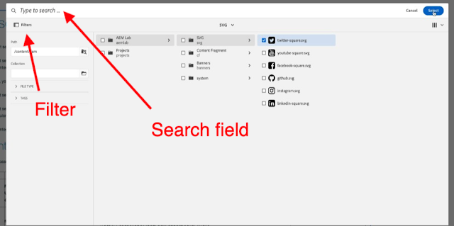
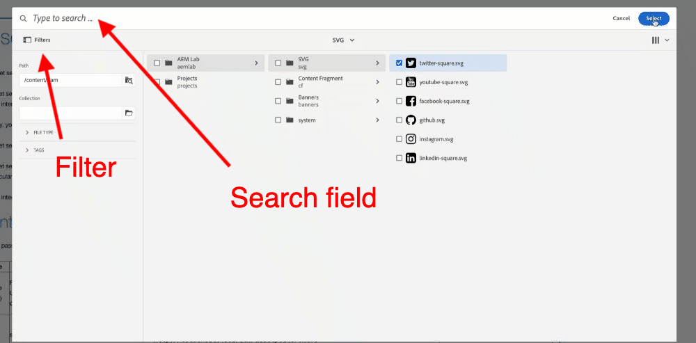
Asset Selector Picker vs Default Picker

Asset Selector gives option to serach and filter, whereas default picker is just allow you to navigate and select in a tree

Asset Selector


Default Picker


AEM - Authoring - Multifield counter

Multifield component allows to add/reorder/remove multiple instances of a field.

In the simplest case this is a simple form input field (e.g. textfield, textarea) but it can also be a complex component acting as an aggregate of multiple subcomponents 


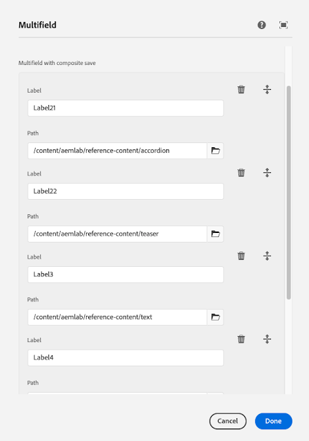
I created a simple dialog which has textfield and pathfield types as subcomponents and look like below in the diagram.I have also authored this with 5 multifield items which are shown in below. 

Can you see all 5 items? Answer is No and to see all 5 you need to scroll down in the form. 

The current design does not gives hint of how many items are there and where individuals item is starts and ends. If the multifield item has many field then it is difficult for Author to visualise this.


Lets write few line of CSS to make it better for readability. Looks better than previous.


With nested multifield


CSS Code

.cq-Dialog coral-multifield coral-multifield-item:not(:first-child){
border-top:2px solid gray;
margin-bottom:10px;
margin-top:20px;
}

.cq-Dialog coral-multifield coral-multifield-item:first-child{
margin-bottom:10px;
margin-top:-10px;
}

.cq-Dialog coral-multifield coral-multifield-item:last-child{
margin-bottom:0px;
margin-top:20px;
}

.cq-Dialog coral-multifield coral-multifield-item .coral3-Multifield-remove,
.cq-Dialog coral-multifield coral-multifield-item .coral3-Multifield-move,
.cq-Dialog coral-multifield coral-multifield-item coral-multifield-item-content{
padding-top:20px
}

.cq-Dialog coral-multifield coral-Multifield-item::before{
content: attr(aria-label);
font-size:1rem;
background-color:lightgray;
color:#919191;
padding:0 10px ;
}


If you want to apply this change to all of the component then create a clientlibs of category cq.authoring.dialog otherwise use exraClientlibs

Above CSS Clientlibs at GitRepo - clientlib-dialog-multifield-decoration

This is tested only in AEMaaCS, this should work in other AEM version as well if coral-multifield-item contains aria-label attribute otherwise you can use CSS counters. e.g. https://github.com/arunpatidar02/aem63app-repo/blob/master/forum/multifield.number.css 


AEM - Authoring - Page Status Visualisation


The AEM sites console http://localhost:4502/sites.html/content can list the AEM pages in List, Column and Card view.

Column View


To check the page status for example if the page is published or not, you need to click on individual page. Due to that the overall pages status in not visible in a glance.


Maximum number of AEM user use this view to navigate through the pages.


Card View

Card view at other hand gives you more information as compare to Column view like locked and Publish/not publish


List View

List view provide more information and option to add/remove columns via settings


but none of the view gives more accurate information like 
if the page is unpublished that means is it never published or unpublished later? 
Whether the page is modified after the publish or before the publish?

And it is impossible to get all this information visually.


What can be done to improve visualisation

The inspiration can be taken from classic UI to show color indicators  or something new can be introduce.
At https://experienceleaguecommunities.adobe.com/t5/adobe-experience-manager-ideas/published-status-visualization/idc-p/461069 some ideas are proposed, If Adobe bring this change would be good for Authors

One of the idea which I implemented as part of PoC looks like 


The color/icon indicators represent the following

 Page is published, after publish no modifications are took place

This page is locked

 Page is unpublished, after unpublish no modifications are done

         Page is published, after publish modifications are took place

 Page is published and locked, after publish no modifications are took place

 This page is locked and modified 

 Page is published and locked, after publish modifications are done.


I am not an UX expert but this is just an attempt to implement the concept of visualisations 


PoC Implementation  

The implementation is done only for column view in this PoC, this is done in AEM as a cloud service, so may not work in other version of AEM

  • The sites column view is generated by /libs/wcm/core/content/sites/jcr:content/views/column resource 
  • The children resources for column collected by /libs/wcm/core/content/sites/jcr:content/views/column/datasource, 
  • The column item rendering is done by /libs/cq/gui/components/coral/admin/page/columnitem 


To add the extra status in column view item response
  • /libs/wcm/core/content/sites/jcr:content/views/column/datasource has to be overlay 
  • New column item renderer need to be created similar to /libs/cq/gui/components/coral/admin/page/columnitem  
  • Add CSS to style the visualisation. 

1. Create Custom columnitem resource

copy /libs/cq/gui/components/coral/admin/page/columnitem in apps e.g. /apps/custom/columnitem
update the columnitem.jsp at /apps/custom/columnitem/columnitem.jsp to add following line of code after  line progressTracker.log("completed lastModified handling");
make sure you have opened and closed JSP tags properly. 

// Adding new property START
            Resource jcrItem = resource.getChild(JcrConstants.JCR_CONTENT);
String replicationAction = "";
boolean lockStatus= false;
boolean lastModifiedStatus = false;

            if(null !=jcrItem){
                ValueMap vm = jcrItem.getValueMap();
                replicationAction = vm.get("cq:lastReplicationAction", String.class) != null ? vm.get("cq:lastReplicationAction", String.class)  : "false";
                lockStatus = vm.get("jcr:lockOwner") != null  ? true : false;

                Calendar createdDate = vm.get("jcr:created",Calendar.class);
                Calendar lastModifiedDate = vm.get("cq:lastModified",Calendar.class);
                Calendar lastlastReplicatedDate = vm.get("cq:lastReplicated",Calendar.class);

                if(lastlastReplicatedDate != null && lastModifiedDate !=null){
                    lastModifiedStatus = lastModifiedDate.getTimeInMillis() > lastlastReplicatedDate.getTimeInMillis() ? true : false;
                }
                else if(createdDate != null && lastModifiedDate !=null){
                    lastModifiedStatus = (int) lastModifiedDate.getTimeInMillis()/1000 > (int) createdDate.getTimeInMillis()/1000 ? true : false;
                }
            }

%>
<div class="coral-columnview-item-extra-status">
<% if(lockStatus){%>
  <coral-icon size="S" icon="lockOn"></coral-icon>
<% }
    if(replicationAction.equals("Activate")){%>
        <coral-icon size="S" icon="globeCheck"></coral-icon>
        <% }
    if(replicationAction.equals("Deactivate")){%>
      <coral-icon size="S" icon="globeRemove"></coral-icon>
        <%}
if(lastModifiedStatus){%>
  <coral-icon size="S" icon="edit" content="<%= lastModifiedStatus %>"></coral-icon>
<% }%>
</div>
<% // Adding new property END 

2. Overlay 

Overlay /libs/wcm/core/content/sites/jcr:content/views/column/datasource to /apps/wcm/core/content/sites/jcr:content/views/column/datasource

copy the all the properties of /libs/wcm/core/content/sites/jcr:content/views/column/datasource to /apps/wcm/core/content/sites/jcr:content/views/column/datasource

update the itemResourceType  property to use custom columnitem created in Step1 


2. CSS/Styling 

Create an clientlibs of category cq.listview.coral.columns.personalization only for css e.g. /apps/custom/author/clientlib-sites-color

create color.css with following css rules

.coral-columnview-item-extra-status{
    order: 1;
}

.coral-columnview-item-extra-status coral-icon{
    height:40px;
}

.coral-columnview-item-extra-status ~ svg._coral-AssetList-itemChildIndicator{
    margin-right: 10px;
}

.coral-columnview-item-extra-status [icon="edit"]{
    background-color: #cfe4ec;
    color: #2466b3;
}

.coral-columnview-item-extra-status [icon="lockOn"]{
    background-color: #a39f9f;
    color: #746f6f;
}

.coral-columnview-item-extra-status [icon="globeCheck"]{
    background-color: #8ed58ea8;
    color: #1e481e;
}

.coral-columnview-item-extra-status [icon="globeRemove"]{
    background-color: #eac1c1;
    color: #b23232;
}


Sample package to try this in local (only for AEMaaCS)


Conclusion 

People with access to an AEM author should be able to be quick in recognizing a node as “never published”, “published”, “unpublished”, “modified” and/or “locked”. 
If the three view modes would be enriched with colours a user would immediately see what status a node is in. Imagine if such colours: red = unpublished, green = published, blue = modified, grey = locked, no colour = never published. 

Although the implementation should be done by Adobe to de-risk the future update impact on overlaying and using custom renderer.

AEMaaCS - Touch UI Dialog Dynamic Dropdown


Populate Touch UI Dropdown Dynamically based on Other Field


In AEM touch UI, the dropdown options can be populated using static fields or using datasource but the dropdown options are static. Let's say I need to create a dropdown for state and the state values should populate based on country, In this case above two methods will not work. but this can be achieved using dialog listeners. 

This blog is about an example to populate second dropdown options based on the first dropdown.

Steps

1.  Create the first dropdown and populate the options either with fixed values or from datasource. add a granite class to listen to the changes.     

<contenttype
 granite:class="dropdownfield_contenttype"
 jcr:primaryType="nt:unstructured"
 sling:resourceType="granite/ui/components/coral/foundation/form/select" 
 fieldDescription="The type of the content"
 fieldLabel="Content Type"
 name="./type">
 <datasource
  jcr:primaryType="nt:unstructured"      sling:resourceType="aemlab/dialog/granite/components/select/datasource/content/type"/>
</contenttype>


2. Create a second dropdown without any options and add a granite class            
 
<contentsubtype
  granite:class="dropdownfield_contentsubtype"
  jcr:primaryType="nt:unstructured"           sling:resourceType="granite/ui/components/coral/foundation/form/select"
  fieldDescription="The subtype of the content"
  fieldLabel="Content SubType"
  name="./subtype"/>


3. Create a hidden field for the second dropdown to repopulate pre-saved value on a dialog load. The name property must be the same as the secondary dropdown and this field must be disabled and hidden.
                                 
<contentsubtype-hidden                         granite:class="dropdownfield_contentsubtype--hidden"
 jcr:primaryType="nt:unstructured"
 sling:resourceType="granite/ui/components/coral/foundation/form/hidden"
 disabled="{Boolean}true"
 name="./subtype"/>


4. Create Clientlibs(javascript) to populate the second dropdown based on the first dropdown value. The values of the second dropdown can be populated based on any business logic. 

Here I am calling a servlet /apps/aemlab/concept/utils/dialog/contentsubytpe.json with the first dropdown value and getting the options for the second dropdown.

     const contentTypeSelector = ".dropdownfield_contenttype";
    const contentSubTypeSelector = ".dropdownfield_contentsubtype";
    const contentSubTypeDataSourceUri =
        "/apps/aemlab/concept/utils/dialog/contentsubytpe.json";

    $document.on("foundation-contentloaded", function (e) {
        setSubTypeDropdown(true);
    });

    $document.on("change", contentTypeSelector, function (e) {
        setSubTypeDropdown(false);
    });

    function setSubTypeDropdown(preSelect) {
        const contentType = document.querySelector(contentTypeSelector);
        const contentSubType = document.querySelector(contentSubTypeSelector);

        if (contentType && contentSubType) {
            var url =contentSubTypeDataSourceUri +"?type=" +contentType.value +"&ck=" +Math.random();
            $.get(url, function (data) {
                updateSubTypeDropdownField(preSelect, data);
            });
        }
    }

Complete Javascript Code at  

Dialog


dialog


GitHub

All the code and component example are available at 
Component : 
https://github.com/arunpatidar02/aemaacs-aemlab/tree/master/ui.apps/src/main/content/jcr_root/apps/aemlab/oneweb/concept/components/dropdown-dynamic
Secondary Dropdown Source Path :
https://github.com/arunpatidar02/aemaacs-aemlab/tree/master/ui.apps/src/main/content/jcr_root/apps/aemlab/oneweb/concept/utils/dialog/contentsubytpe
First Dropdown datasource and secondary dropdown Servlet :
https://github.com/arunpatidar02/aemaacs-aemlab/tree/master/core/src/main/java/com/community/aemlab/oneweb/core/servlets/ds
The above code is tested in AEM as a Cloud Service, but it will work with standard AEM as well.

cq:isContainer Property in AEM

 It’s a common use case to create components that include other components. These components are called “Container Components” e.g. parsys, etc and are denoted by adding cq:isContainer="{Boolean}true" as a property on the component.

Why is it important to add cq:isContainer property to container component?

The answer is simple to make sure the component must behave like a container component. You must be thinking what does it even mean? Let's understand this with an example.
I have 3 components, component-container, component-a, component-b
The component structure would be:

component-container
|----- component-a
|----- component-b

i.e.
/apps/weretail/components/demo/component-container/component-container.html

   <div class="c-component-container">
      <div data-sly-resource="${'a' @ resourceType='/apps/weretail/components/demo/component-a'}"/>
      <div data-sly-resource="${'b' @ resourceType='/apps/weretail/components/demo/component-b'}"/>
    </div>

What happens if component-container does not have cq:isContainer property

1. From the Content Tree the hierarchy does not maintain.


2. Let's try to create a livecopy of this page and break the inheritance of the parent component i.e. component-container component 


Livecopy without inheritance broken


After breaking the inheritance for component-container, the inheritance is broken for children components(component-a and component-b) as well. That was not the expectation.


Let's check above 2 scenarios again with cq:isContainer property


The component hierarchy maintains when view content from the Content Tree


The inheritance for children component is not broken when breaking the parent component i.e. component-container component inheritance.


Conclusion

Whenever you create a container component make sure you create proper configuration for the parent component. That could be adding cq:isContainer property or not allowing deleting childer component 
by adding cq:childEditConfig child node to a parent component

<?xml version="1.0" encoding="UTF-8"?>

<jcr:root xmlns:cq="http://www.day.com/jcr/cq/1.0" xmlns:jcr="http://www.jcp.org/jcr/1.0"

          jcr:primaryType="cq:EditConfig"

          cq:actions="[EDITANNOTATE]"/>


You can create a component with all the container configurations and use supertype for other parent components. so can manage this configuration in one place.


AEM - Touch UI Dialog | Field Description with Image

In Touch UI dialog Coral/Granite type fields have fieldDescription property which displays the help text(tooltip) for a field. The value for this property is restricted to have plain text.


property


and It will show fields in a dialog like below:


Improve Authoring Experience

With the headless architecture where the presentation layer is separated from AEM and Author does not have a view on WYSIWYG, to provide a view of how the content is gonna render can be implemented in many ways. One of the options is to use an image in the field description.
OOTB Coral/granite type does not support the HTML tags(due to the encoding), which could have been used to add an image in fieldDescription property. 

To overcome this situation an image can be added as another property fieldDescriptionImage e.g. using data attribute
fieldDescriptionImage = /content/dam/aemlab/system/components/sample/dialog/text.png

The fieldDescriptionImage  property will be added to granite:data node for Coral3/Granite type and for Coral2 to field node.

Later this value from the data attribute(data-fielddescriptionimage) can be read and injected into the existing fieldDescription.


The rendition is used in the above screenshot is cq5dam.thumbnail.140.100.png, Other rendition can also be used.


ClientLibs Code 

  1. Create a clientlibs of category 'cq.authoring.dialog'
  2. Create js.txt , css.txt, dialog.fielddescription.image.css and dialog.fielddescription.image.js files (get the file from Github).


Package

You can install the below packages from https://github.com/arunpatidar02/aem63app-repo/blob/master/packages/aem-touchui-dialog-fielddescription-image/aem-touchui-dialog-fielddescription-image-sample-1.zip  to enable this feature for the Touch UI dialog. These works in AEM 6.3+


If you install this package, the Below files will be installed in the repository at 

  • /apps/touchui-fielddescription-image/clientlibs/lib-touchui-image-field-desrciption/js.txt
  • /apps/touchui-fielddescription-image/clientlibs/lib-touchui-image-field-desrciption/js/dialog.fielddescription.image.js
  • /apps/touchui-fielddescription-image/clientlibs/lib-touchui-image-field-desrciption/css.txt
  • /apps/touchui-fielddescription-image/clientlibs/lib-touchui-image-field-desrciption/css/dialog.fielddescription.image.css
  • /apps/touchui-fielddescription-image/components/sample-component

Limitation:

Work only with along with fieldDescription property and Granite field type.