You already know the use of Granite UI widget's required property - Indicates if the field is mandatory to be filled and shows Please fill out this field , if the field is empty.
But there are cases where the dialog fields are required custom validation with the custom error message.
The custom validations for touch UI dialog fields are very common, which required writing client side javascript/jquery code but end up writing too much code.
Wondering If we can just add few properties for regular expression based validation and it will be done without writing any code.
Note: For AEM 6.3, If regular expression contains \, regex property value should have \\.(Not required in AEM 6.4+)
inline mode error message example
floating mode error message example:


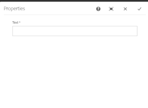 |
| OOTB required property validation |
The custom validations for touch UI dialog fields are very common, which required writing client side javascript/jquery code but end up writing too much code.
Wondering If we can just add few properties for regular expression based validation and it will be done without writing any code.
Solution
This solution is inspired by classic UI widget regex and regexText properties, which allow widget(field) value checked against regex property value and shows the custom error message, set in regexText property. The solution for Touch UI can be the same, which allows custom validation for Granite(Coral3) fields.
Properties
Field Level Properties
To allow custom validation, a granite:data node of type nt:unstructured will be created as the field's sibling node and following properties can be added to granite:data node(To create data attribute in HTML Dom), more details about granite:data node at granite:data :
- regex
- regexText
- regexMode
- min
- max
Name
|
Type
|
Description
|
regex
|
String
|
This is mandatory property, specify the type of validation based on values. Values can be Regular Expression, required or multifield.
|
regexText
|
String
|
Specify the message to be displayed in case of field input is not valid. Invalid input is the default.
|
regexMode
|
String
|
Indicates how to display error messages. Values can be inline, floating or auto. inline is default.
|
min
|
String
|
Define Minimum items required for the Multifield.
|
max
|
String
|
Define Maximum items allowed for the Multifield.
|
Note: Only regex property is mandatory, Others are optional properties. min and max both are optional and will be used if regex property value is multifield.
Configuring regex property
regex property can have the following values based on the type of validation.
Value
|
Description
|
Regular Expression
|
If value is set to regular expression, field will be validated against specified regular Expression string (.e.g. ^#([A-Fa-f0-9]{3}){1,2}$).
|
required
|
If the field is mandatory to be filled.
|
multifield
|
If the multifield is mandatory to have minimum or/and maximum items. In this case, min and/or max properties should be set.
|
 |
| granite:data node and regex & other properties |
 |
| multifield min and max item validation proerties value |
Note: For AEM 6.3, If regular expression contains \, regex property value should have \\.(Not required in AEM 6.4+)
Note: Since AEM removes the backslash(if not escape) as soon as the property is saved, to avoid that in AEM 6.3, use \\\\ and for 6.4+ use \\ while creating regex property value.
Tips:
For Regular Expression: \w+([\.-]?\w+)*@\w+([\.-]?\w+)*(\.\w{2,3})+$ , use below values for regex property before save.
AEM 6.3 --> ^\\\\w+([\\\\.-]?\\\\w+)*@\\\\w+([\\\\.-]?\\\\w+)*(\\\\.\\\\w{2,3})+$
AEM 6.4 and above --> ^\\w+([\\.-]?\\w+)*@\\w+([\\.-]?\\w+)*(\\.\\w{2,3})+$
AEM 6.4 and above --> ^\\w+([\\.-]?\\w+)*@\\w+([\\.-]?\\w+)*(\\.\\w{2,3})+$
As soon as you save the property AEM will remove the extra \ and after refreshing granite:data node, regex property value should be look like below:
AEM 6.3 --> ^\\w+([\\.-]?\\w+)*@\\w+([\\.-]?\\w+)*(\\.\\w{2,3})+$
AEM 6.4 and above --> ^\w+([\.-]?\w+)*@\w+([\.-]?\w+)*(\.\w{2,3})+$
AEM 6.4 and above --> ^\w+([\.-]?\w+)*@\w+([\.-]?\w+)*(\.\w{2,3})+$
To make sure, regex property value is correct, regular expression can be varified from fields HTML DOM. For above regular expression (either 6.3 or 6.4 syntax), the value of data-regex attribute of fields HTML DOM should render the regular expression without escaping \ i.e. \w+([\.-]?\w+)*@\w+([\.-]?\w+)*(\.\w{2,3})+$. i.e. data-regex="^\w+([\.-]?\w+)*@\w+([\.-]?\w+)*(\.\w{2,3})+$"
<input class="coral-Form-field coral3-Textfield" data-regexmode="auto" data-regextext="Invalid email address" data-regex="^\w+([\.-]?\w+)*@\w+([\.-]?\w+)*(\.\w{2,3})+$" type="text" name="./email" labelledby="label_c9fe8014-e6fe-40c0-91a4-f14b88980b99 description_c9fe8014-e6fe-40c0-91a4-f14b88980b99" value="" data-foundation-validation="" data-validation="" is="coral-textfield" id="coral-id-2300" aria-labelledby="label_c9fe8014-e6fe-40c0-91a4-f14b88980b99 description_c9fe8014-e6fe-40c0-91a4-f14b88980b99" aria-invalid="false">
Configuring regexMode property
Value
|
Description
|
inline
|
The error message will be displayed alongside field in the component dialog, similar to OOTB required property validation error.
|
floating
|
To display error message in modal(popup) window
|
auto
|
Error message will be shown in both the mode, i.e. inline as well as floating(popup).
|
|
| regexMode property |
inline mode error message example
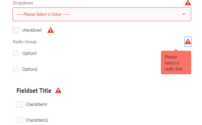 |
| Error message displays alongside field |
floating mode error message example:
The popup message only displays invalid items rows in below format
- Tab--> FieldLabel : RegexText.
- And for multifield Tab--> FieldLabel[index] : RegexText.
 |
| Popup shows error message for invalid fields(Tab-->FieldLabel: Message) |
 |
| Popup shows error message for invalid fields inside multifield(Tab-->FieldLabel[index]: Message) |
in case of there is no tab in dialog or fieldLabel missing, then the message will be shown accordingly.
In below screenshot, the fieldLabel is missing except one field.
 |
| Popup shows error message for invalid fields with Field Label(Tab--> Message) |
 |
| Popup shows error message for invalid fields without tabs(FieldLabel: Message) |
Dialog Level Properties:
In case of regexMode property value is floating. The popup dialog Header and content Header can also be set using the following dialog level properties, which will be added in the child node of cq:dialog node.
Name
|
Type
|
Description
|
regex-modal-heading
|
String
|
This property specifies the Header text of modal(popup). Dialog cannot be submitted is default
|
regex-content-heading
|
String
|
Popup dialog content header. Following Fields are invalid is default.
Getting Started
|


Getting Started
Prerequisites
To use solution a clienlibs of category cq.authoring.dialog needs to be created in AEM from crxde. The copy clientlibs js, css, js.txt and css.txt files from Github location (https://github.com/arunpatidar02/aem-touchui-validation/tree/master/touchui-regex-validation)
- touchui.regex.validation.css file from css folder
- touchui.regex.validation.js file from js folder
- js.txt and css.txt
Create Properties
- Create granite:data node parallel(sibling) to item node
- Add regex and other properties
Note :
- No need to create granite:data node for RTE(cq/gui/components/authoring/dialog/richtext) field. regex and other properties can be added directly to RTE field node.
- For checkboxList validation(atleast one should be checked) add properties to granite/ui/components/coral/foundation/form/fieldset node.

Supports
This solution is mainly targeted for the newer version on AEM(6.3+) and for most used granite input type resources. Below is the list of supported AEM version and Resource types.
AEM Version
AEM 6.3 and above
Granite(Coral3) Resource type
- granite/ui/components/coral/foundation/form/textfield
- granite/ui/components/coral/foundation/form/numberfield
- granite/ui/components/coral/foundation/form/textarea
- cq/gui/components/authoring/dialog/richtext
- granite/ui/components/coral/foundation/form/select
- granite/ui/components/coral/foundation/form/checkbox
- granite/ui/components/coral/foundation/form/radiogroup
- granite/ui/components/coral/foundation/form/fieldset
- granite/ui/components/coral/foundation/form/pathfield
- granite/ui/components/coral/foundation/form/pathbrowser
- cq/gui/components/authoring/dialog/fileupload
- granite/ui/components/coral/foundation/form/colorfield
- granite/ui/components/coral/foundation/form/datepicker
- granite/ui/components/coral/foundation/form/multifield
Features
- The solution is based on javascript, no need to do any server side changes or resource overlay.
- Easy to plug-in and remove into existing aem dialog clientlibs.
- Supports latest versions of AEM i.e. AEM 6.3, 6.4 and 6.5.
- Supports most commonly used Granite(Coral3) resources type fields.
- Supports with design dialog or policy(static and dynamic templates).
- Easy to use.
Limitations
- Doesn't support coral2 type resource type.
- May not work in 6.2 with Granite resources.
- Only supports Granite resources(mentioned in the Supports section)
- The popup message does not show complete breadcrumb for the invalid item.
- Doesn't show *(mandatory) alongside field's FieldLable text.
- If OOTB required property and regex property both will be used for cq/gui/components/authoring/dialog/fileupload, This can result in conflict and dialog would not be submitted. Avoid using both OOTB required property validation and this custom validation together for a field. However, both type of validation can be used together for different fields for the same dialog.
Code
Sample Package
This package contains clientlibs and sample component dialog with all above fields property setup
Github repository - https://github.com/arunpatidar02/aem-touchui-validation
Conclusion
This is a solution to avoid writing code for regex type of validation but this is more an idea, I hope Adobe would come up with a concrete solution like classic UI regEx validation.
Not working
ReplyDeleteit is not working
ReplyDeletecan you please try with coral3 types and what issue are you facing, can you share in details at https://github.com/arunpatidar02/aem63app-repo/issues
ReplyDelete